Every NFL team has a helmet that its respective fanbase has grown to adore whether it’s visually appealing or not. The unconditional love fans have for their team is what makes professional sports so amazing.
However, many franchises have ugly uniforms in the minds of outsiders. With that in mind, here’s a look at every NFL team’s helmet ranked from worst to first.
Timothy Downs is a Senior Writer for www.RantSports.com. You can ‘like him’ on Facebook add him on Google or follow him Twitter @Tidow1212

32. Washington Redskins
 Credit: Getty Images
32. Washington Redskins
Whether you believe it should or should not, the Washington Redskins' helmet sadly offends a portion of our country's Native American population. Therefore, it lands at No. 32.
31. New Orleans Saints
 Credit: Getty Images
31. New Orleans Saints
The New Orleans Saints have a 'fleur de lis' symbol on their helmet, which many feel is racist in nature due to its history (which you can look up and decide for yourself). It seems like a rebrand is needed at this point. Washington and New Orleans are tied for the worst in my humble opinion.
30. Kansas City Chiefs
 Credit: Getty Images
30. Kansas City Chiefs
The Kansas City Chiefs showcase the most bland helmet in the NFL. It's just an arrowhead with the letters 'KC' and that's it. It's that simple. Really. The Chiefs need a rebrand in the worst way.
29. Tennessee Titans
 Credit: Getty Images
29. Tennessee Titans
Don't get me wrong: the Tennessee Titans' helmet isn't all bad. The colors are excellent, but what's the deal with the flame? With all the money in the world to spend on an expert graphic designer, there has to be a way to come up with something a tad more inviting.
28. San Francisco 49ers
 Credit: Getty Images
28. San Francisco 49ers
The San Francisco 49ers have an undeniably rich history, but also an undeniably ugly helmet. It's especially ugly when worn with the new black alternate jersey the 49ers debuted this season. Perhaps a revamped roster is not the only thing that's needed in San Francisco.
27. Cleveland Browns
 Credit: Twitter
27. Cleveland Browns
The Cleveland Browns are a boring team to watch on the field most years, which makes their painfully bland helmets even tougher to look at.
26. New York Giants
 Credit: Getty Images
26. New York Giants
The New York Giants helmet isn't ugly, per se. However, it's incredibly boring. I understand tradition is important to the organization, but spicing things up a bit couldn't hurt.
25. Pittsburgh Steelers
 Credit: Getty Images
25. Pittsburgh Steelers
Let's be honest: Most people have no clue that the Pittsburgh Steelers logo is based on the Steelmark logo belonging to the American Iron and Steel Institute. I understand tradition is important, but their logo is painfully ugly.
24. New York Jets
 Credit: Getty Images
24. New York Jets
Despite being a New York Jets fan, I fully recognize that my beloved team's helmet isn't impressive whatsoever. The colors are outstanding, but the typography is about as exciting as an amoeba at a dance party. Incorporating a jet of some sort into the mix seems like a no-brainer.
23. Detroit Lions
 Credit: Getty Images
23. Detroit Lions
The Detroit Lions showcase a visually appealing color scheme, but the lion on their helmet wasn't exactly designed by one of the world's premier graphic artists. This helmet could be a top five with a more 'lion-ish' looking lion.
22. Baltimore Ravens
 Credit: Getty Images
22. Baltimore Ravens
With a few tweaks, the Baltimore Ravens could have a top five helmet. Perhaps something with more purple would work considering it's their primary color.
21. New England Patriots
 Credit: Getty Images
21. New England Patriots
I've never understood why the guy on the New England Patriots helmet has a bigger chin than Jay Leno. With some tweaking, however, this one could be in the top five in the future.
20. Houston Texans
 Credit: Getty Images
20. Houston Texans
I don't have much of an opinion on Houston's helmet. It isn't a work of art by any means, but I don't see a ton of negatives either.
19. Buffalo Bills
 Credit: Getty Images
19. Buffalo Bills
I love the concept of Buffalo's helmet, but the final product leaves plenty to be desired.
18. Tampa Bay Buccaneers
 Credit: Getty Images
18. Tampa Bay Buccaneers
Tampa Bay's helmet is too much of an Oakland Raiders knockoff if you ask me. It isn't ugly by any means, but it just doesn't seem genuine.
17. Carolina Panthers
 Credit: Getty Images
17. Carolina Panthers
I love everything about Carolina's helmet. But popular consensus suggests panthers outlined in hot blue just aren't that intimidating.
16. Atlanta Falcons
 Credit: Getty Images
16. Atlanta Falcons
If the Atlanta Falcons could figure out a way to tone their helmet down just a tad, they could easily flirt with the top five in the future. The concept and color scheme are in place, but a new designer is needed.
15. Miami Dolphins
 Credit: Getty Images
15. Miami Dolphins
The only thing I don't like about Miami's helmet is that the dolphin looks like it's asleep. The Dolphins are a football team, after all, and are supposed to 'look alive' out on the field.
14. Jacksonville Jaguars
 Credit: Getty Images
14. Jacksonville Jaguars
I love Jacksonville's helmet. In fact, I think it has No. 1 potential. But for the life of me, I can't figure out why the black portion looks like it was spray painted on. A shiny black coat would have made this helmet a contender.
13. Chicago Bears
 Credit: Getty Images
13. Chicago Bears
Chicago's logo is bland, but jumps out at you at the same time.
12. Green Bay Packers
 Credit: Getty Images
12. Green Bay Packers
The same can be said for the Green Bay Packers. The helmet is basic, but it gets the job done and is still visually stimulating.
11. Seattle Seahawks
 Credit: Getty Images
11. Seattle Seahawks
Everything about Seattle's helmet is excellent, except for that bird's eye. That's just creepy.
10. Minnesota Vikings
 Credit: Getty Images
10. Minnesota Vikings
Minnesota's helmet is a true classic. Sometimes, designing a stellar helmet has more to do with the nickname than anything else. Viking horns on the Vikings helmet is a perfect example of that statement.
9. Denver Broncos
 Credit: Getty Images
9. Denver Broncos
Denver's helmet is clearly worthy of its top 10 spot. The orange eye of the horse proves how the tiniest details can make a world of difference in designing.
8. Indianapolis Colts
 Credit: Getty Images
8. Indianapolis Colts
Indianapolis' helmet is the perfect example of how simple logos look the best when spread out across the entirety of the object they're placed on. My only criticism of the Colts helmet is I believe the cage should be blue.
7. Philadelphia Eagles
 Credit: Getty Images
7. Philadelphia Eagles
The eagle wings fit perfectly on the side of Philadelphia's helmet. However, a white cage is needed to make the Eagles helmet a true No. 1 contender.
6. Cincinnati Bengals
 Credit: Getty Images
6. Cincinnati Bengals
It's incredibly difficult to find a flaw in Cincinnati's helmet. Orange isn't everyone's favorite color, but in this instance, it kills as the Bengals' primary.
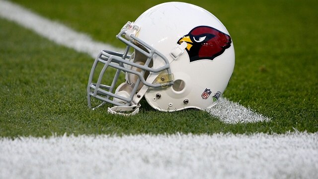
5. Arizona Cardinals
 Credit: Getty Images
5. Arizona Cardinals
I'm not sure exactly what would help, but Arizona's helmet could be the No. 1 with an adjustment made to the front, which is rather plain.
4. St. Louis Rams
 Credit: Getty Images
4. St. Louis Rams
St. Louis' helmet is truly a thing of beauty. The ram horns perfectly encompass the entire helmet, and the color scheme is second to none. I'd make the grill dark blue, but that's just a nitpick.
3. Oakland Raiders
 Credit: Getty Images
3. Oakland Raiders
You can't go wrong with the silver and black.
2. Dallas Cowboys
 Credit: Getty Images
2. Dallas Cowboys
Dallas' helmet pales in comparison to none. But it falls just shy of the No. 1 ranking.
1. San Diego Chargers
 Credit: Getty Images
1. San Diego Chargers
It's impossible to argue against San Diego at No. 1. The lightning bolt lined in powder blue is simply a masterpiece.
 Share
Share 


